KAROUMPALIS
The story
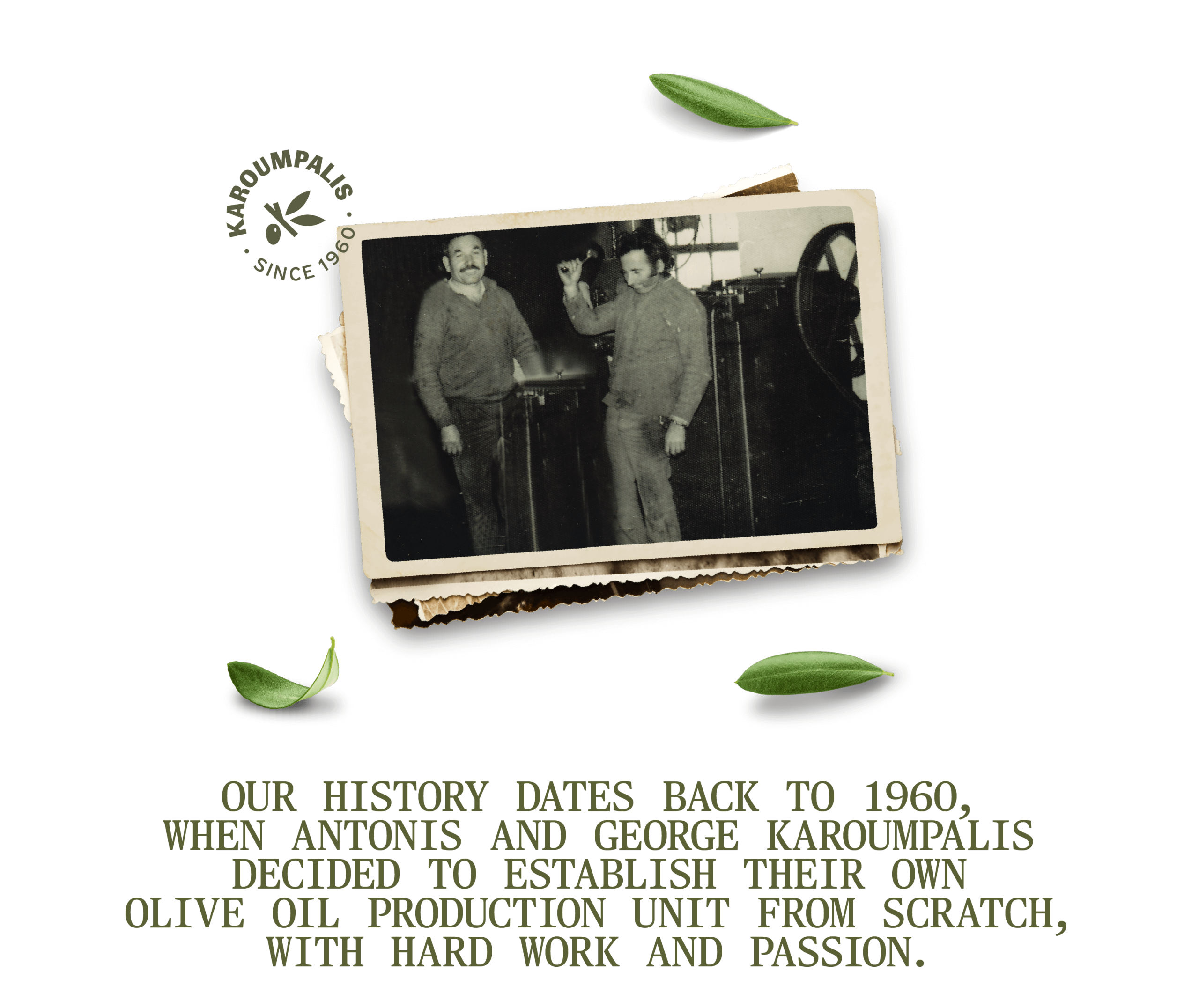
Karoumpalis, a family-owned business active in the olive oil sector since 1960, entrusted us with redefining its brand in the market. With respect for its history and roots, we approached the project with a fresh perspective, preserving the authenticity and quality that have defined the brand for decades.
Yπηρεσίες
Karoumpalis is renewed, the values remain
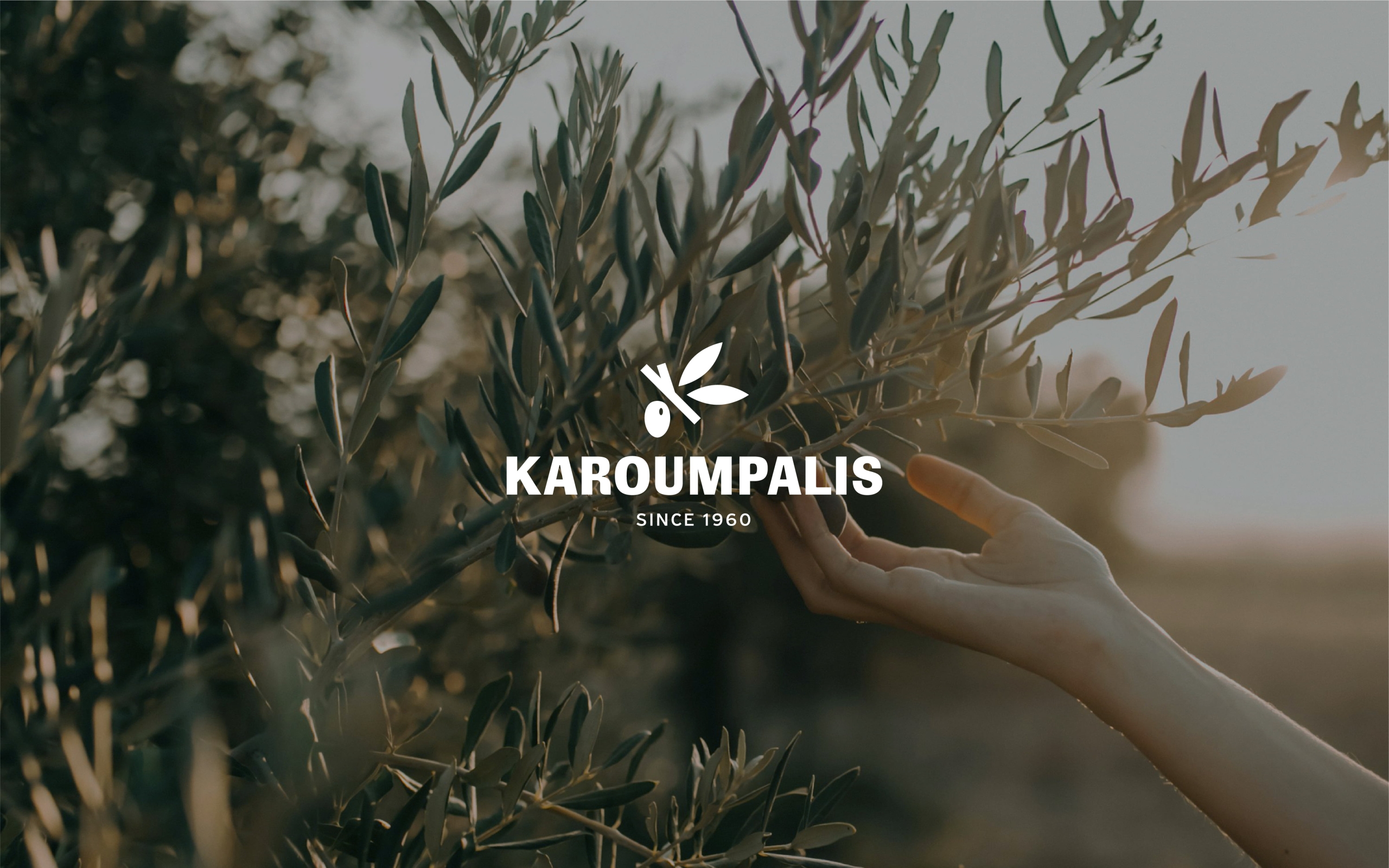
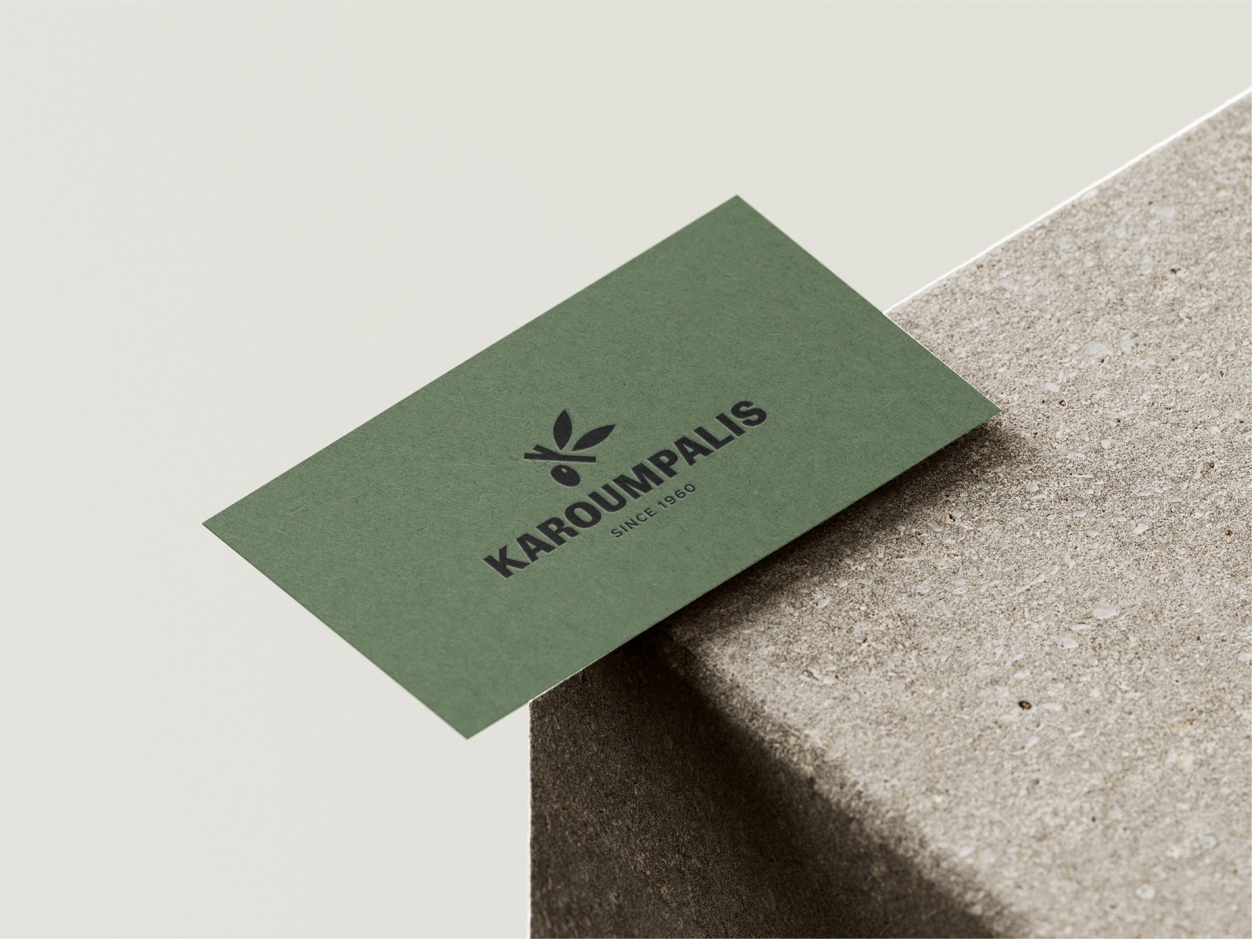
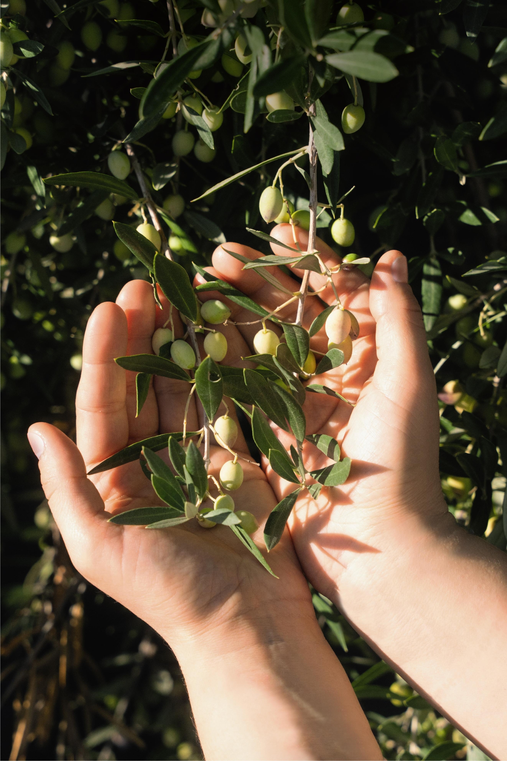
Our goal was to create a unified image that bridges the past with the present: honoring tradition while appealing to a new, more contemporary audience. Through research, we repositioned the brand in the market. We meticulously redesigned the logo to reflect the brand’s modern perspective. We proceeded with the copywriting for the new website, narrating the family’s long history in olive oil production, highlighting traditional methods and clearly conveying the value and quality of the products. Special emphasis was placed on the production of original photography and video, which not only serve a supporting role, but also convey the emotions, visuals and aromas of the land. In this way, the new identity is not just an aesthetic construct, but a multi-dimensional experience.
The Website
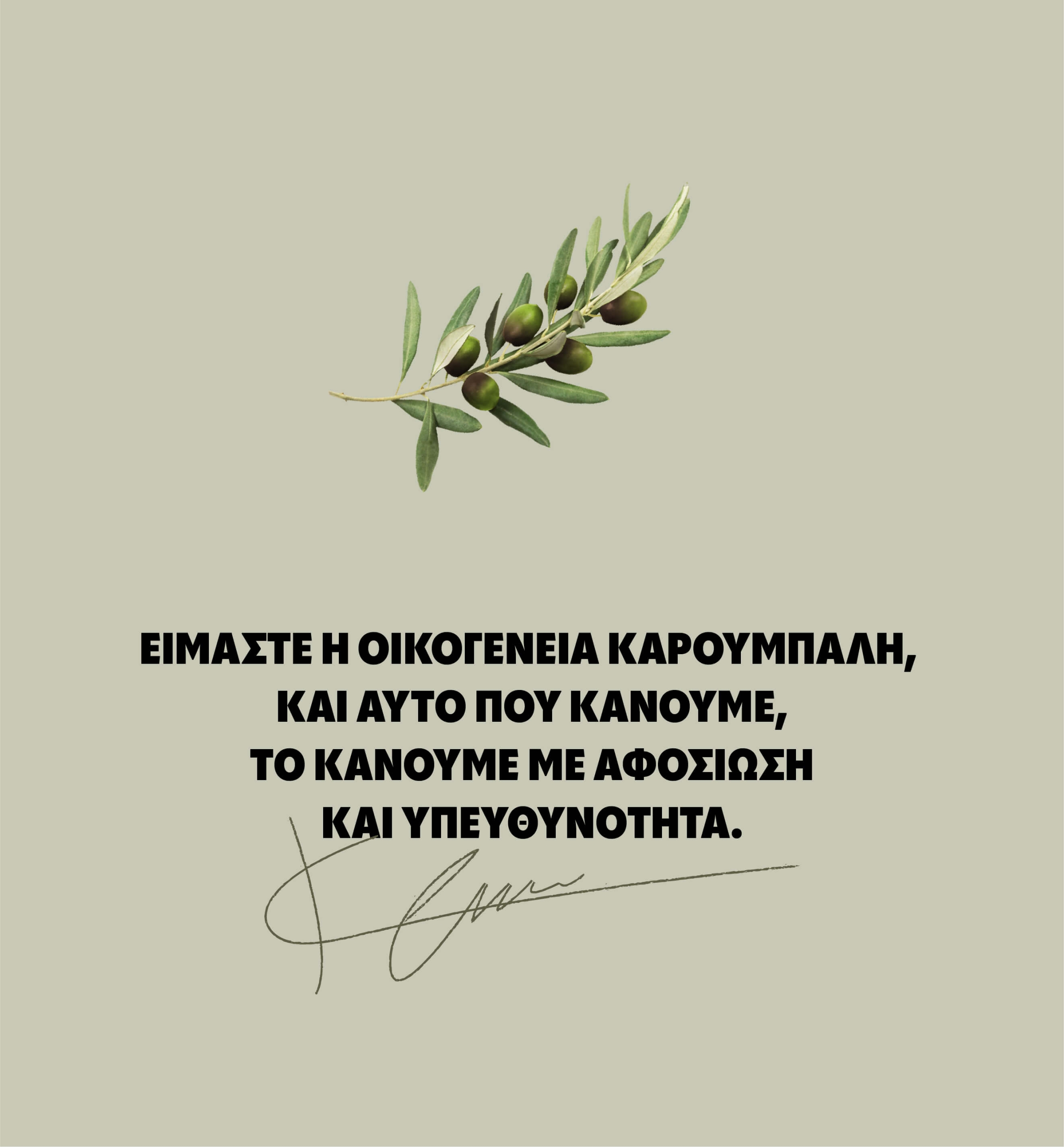
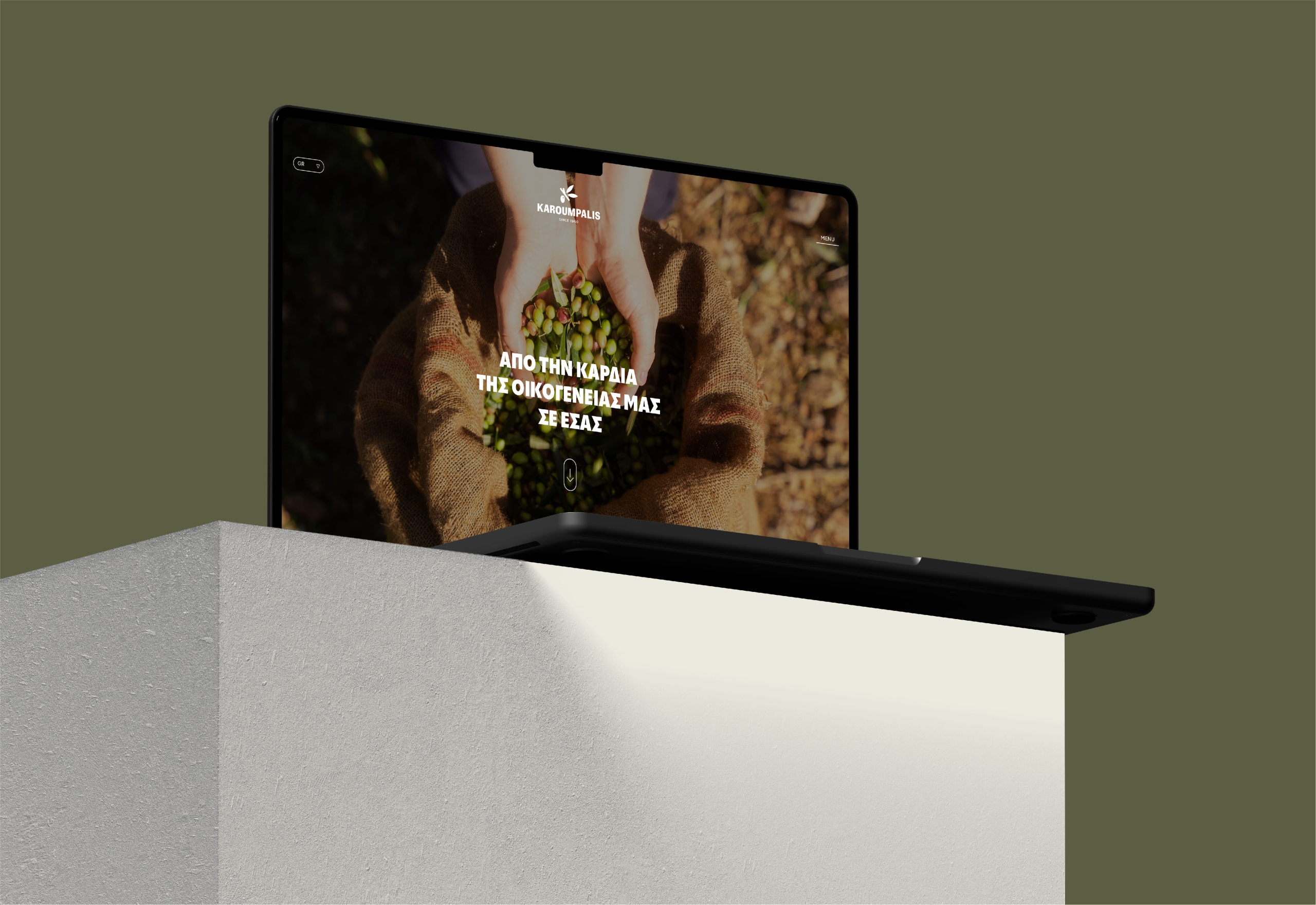
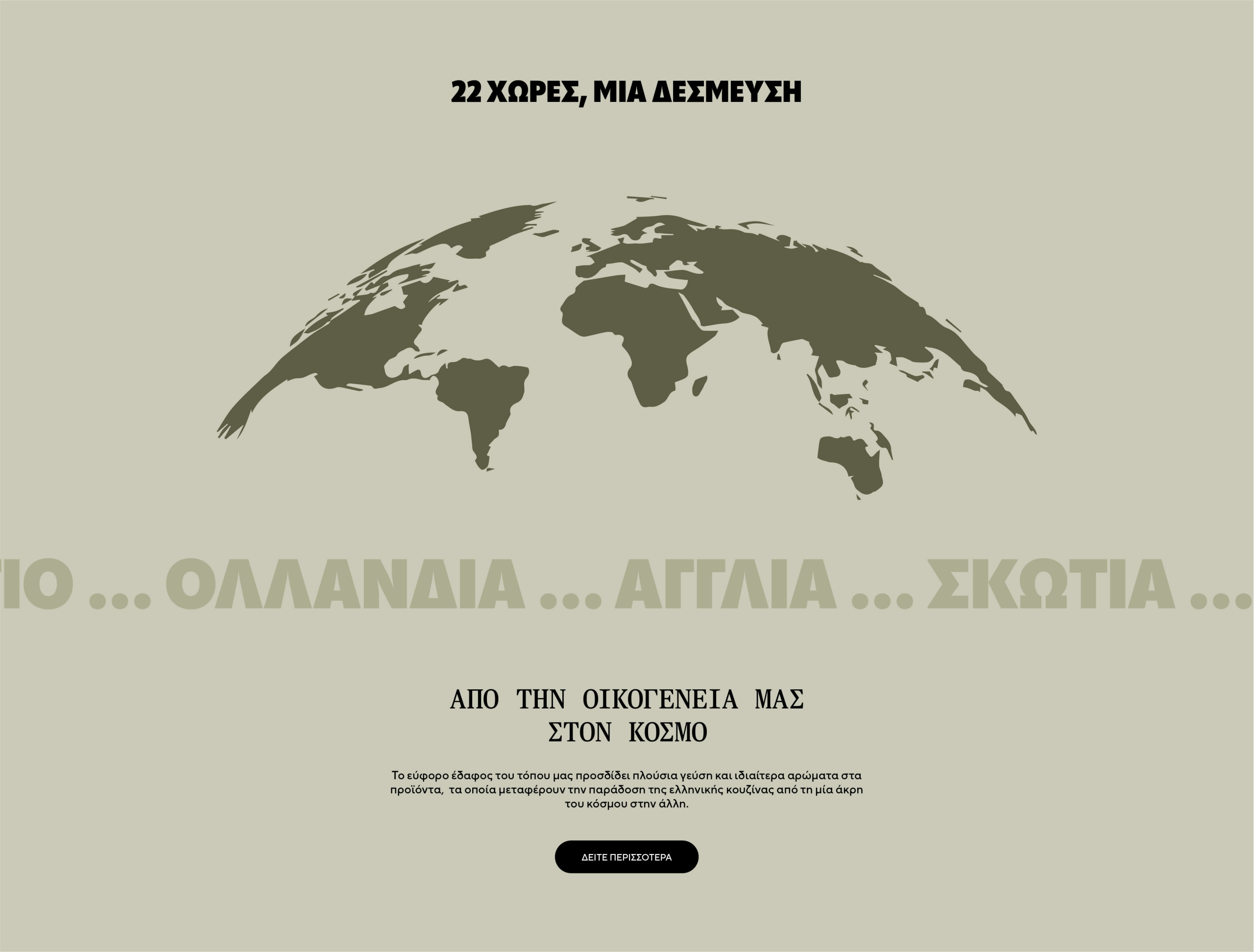
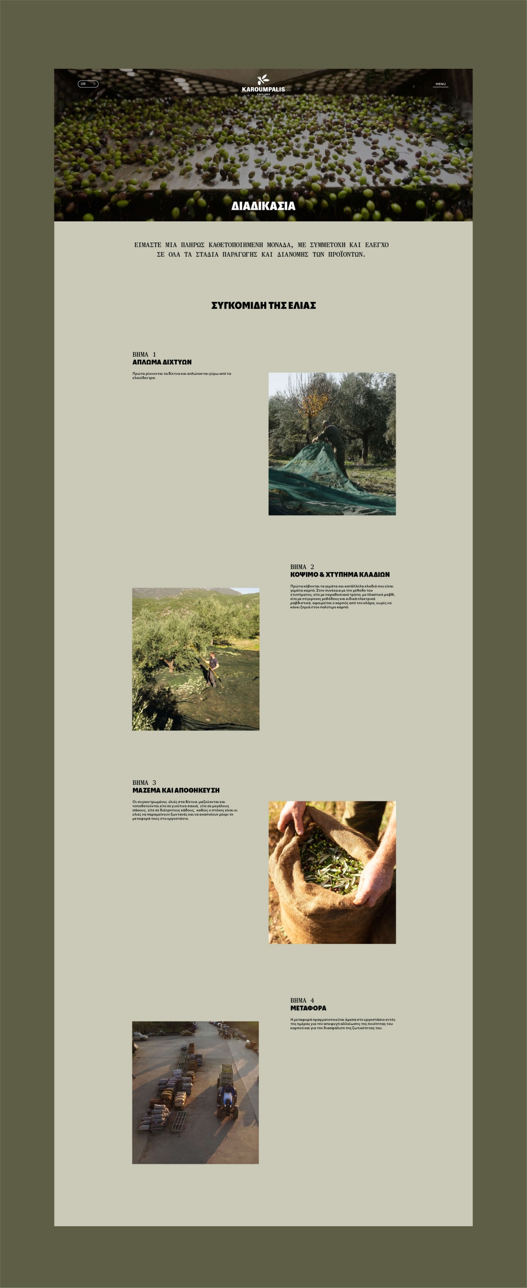
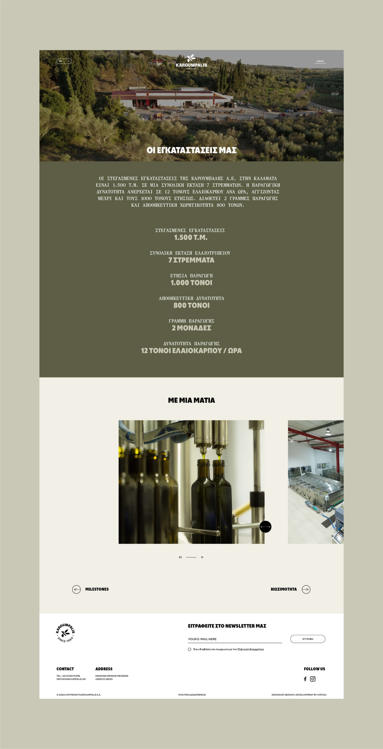
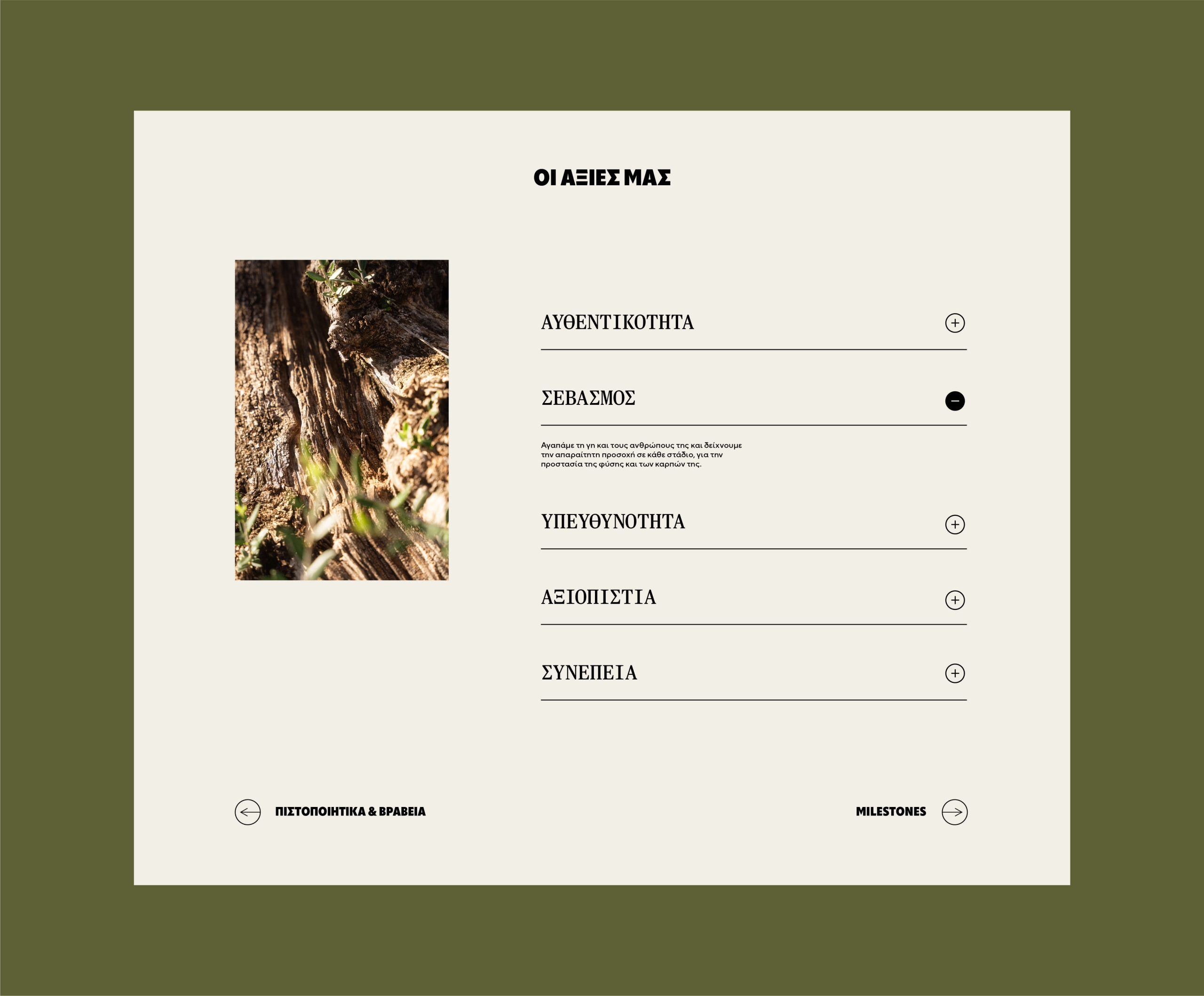
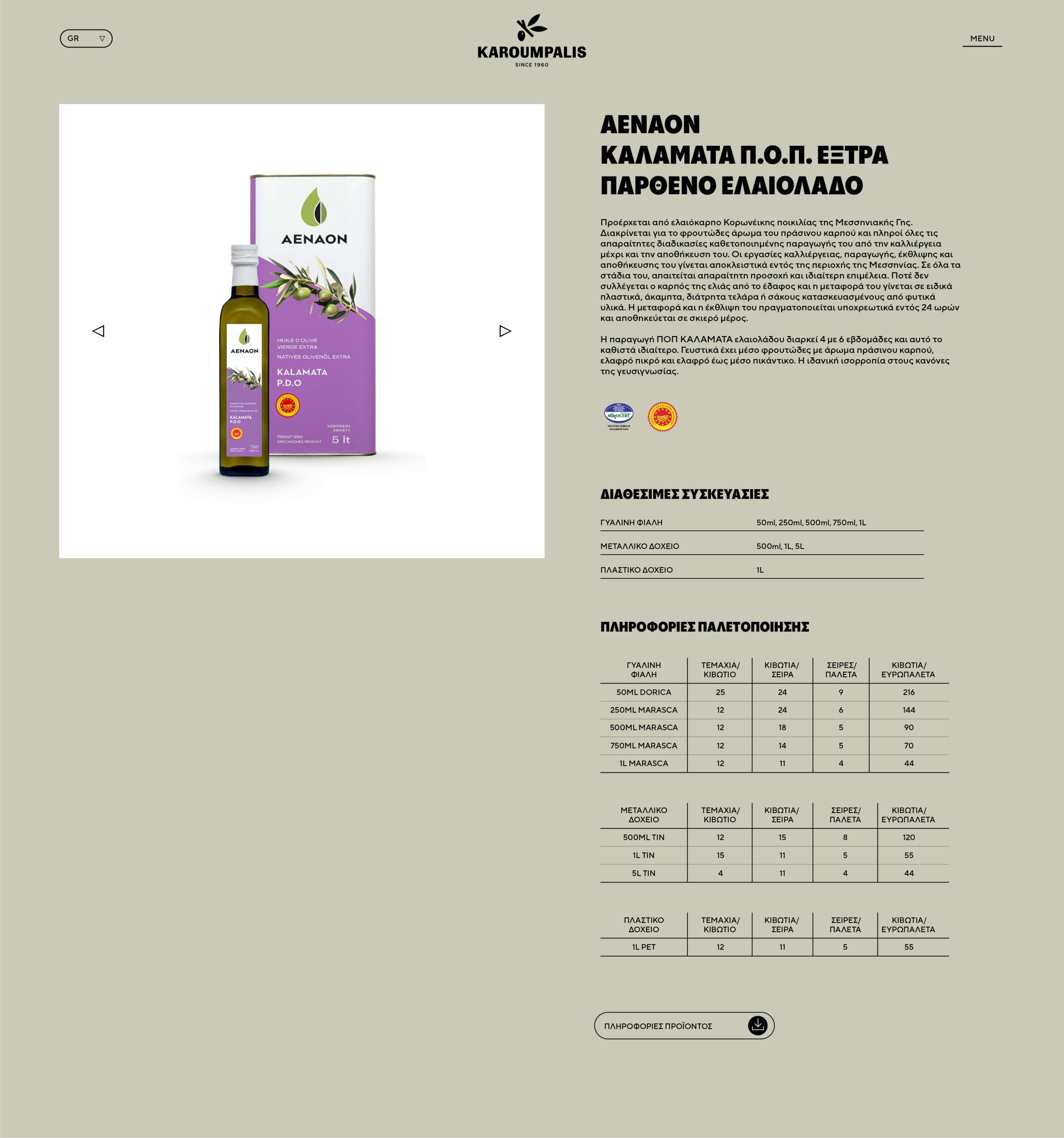
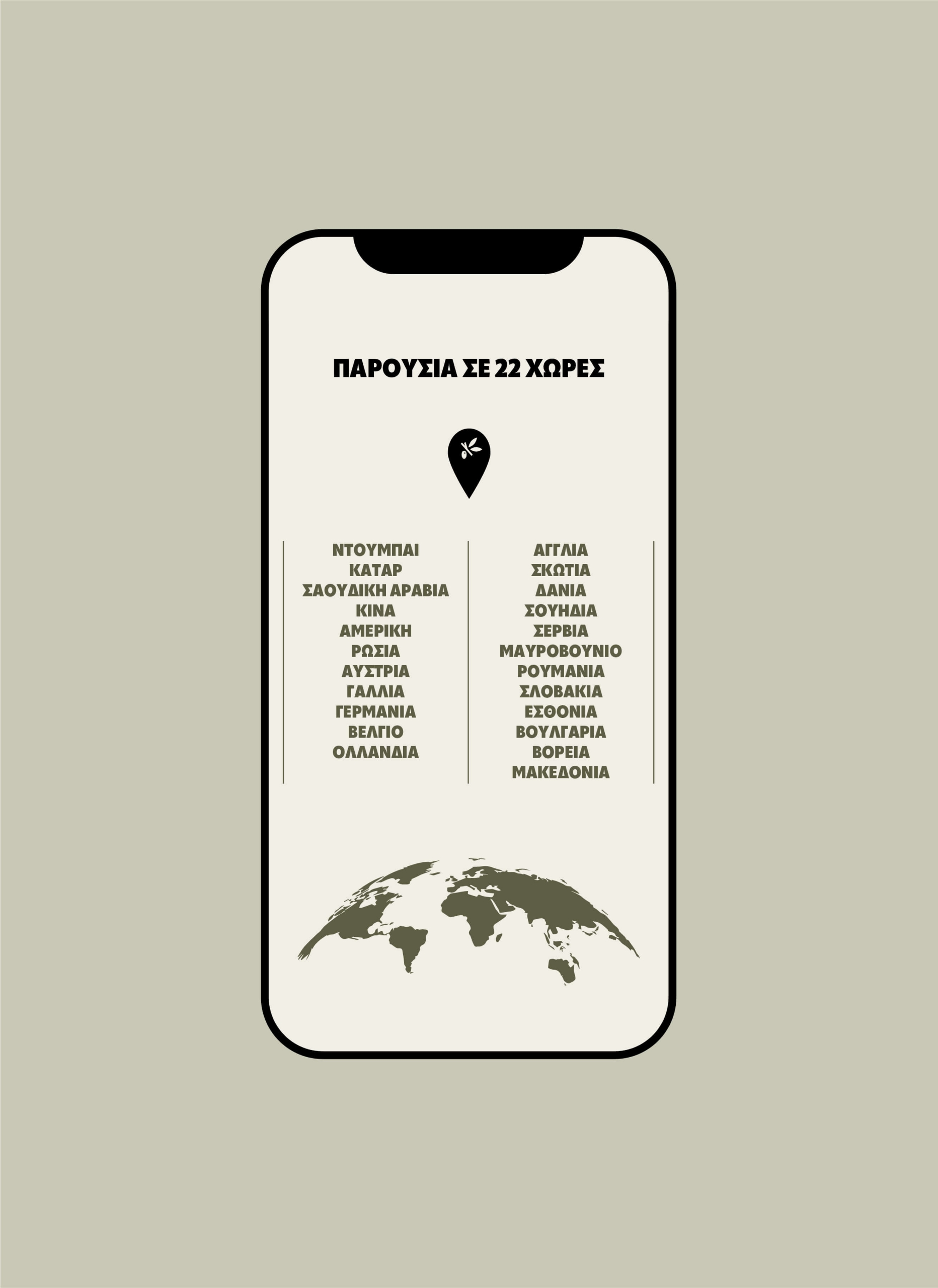
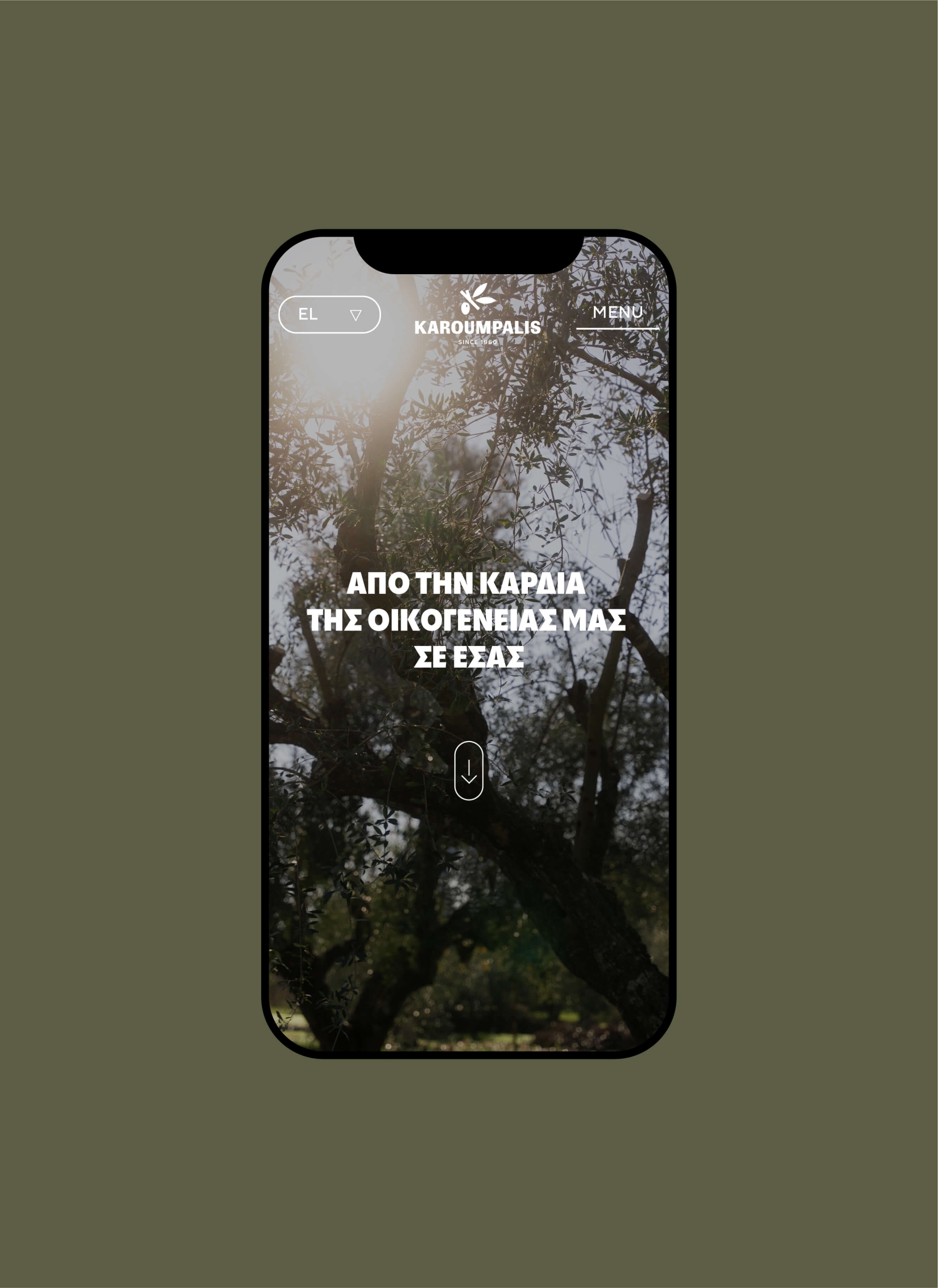
The new website reflects the freshness of the brand’s renewed image, with a minimal aesthetic, bold use of photography and emphasis on the product’s authenticity. Our approach is friendly, earthy and genuine, as these qualities reveal the product’s origin and respect for nature. All these elements compose a new, cohesive identity that highlights the uniqueness of Karoumpalis olive oil and clearly communicates the company’s values.
Packaging
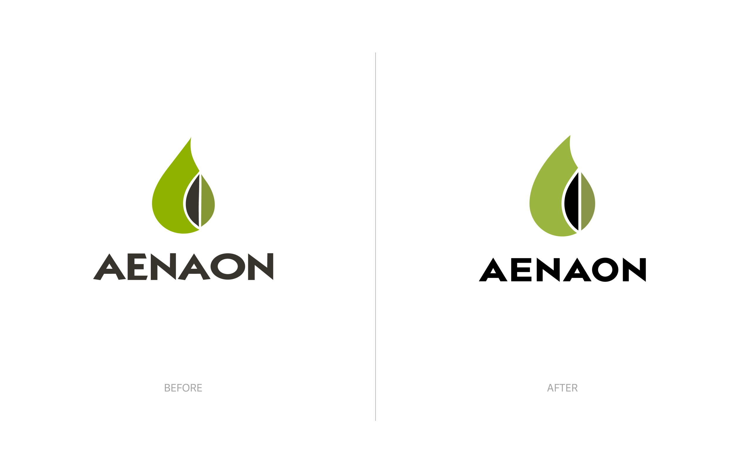
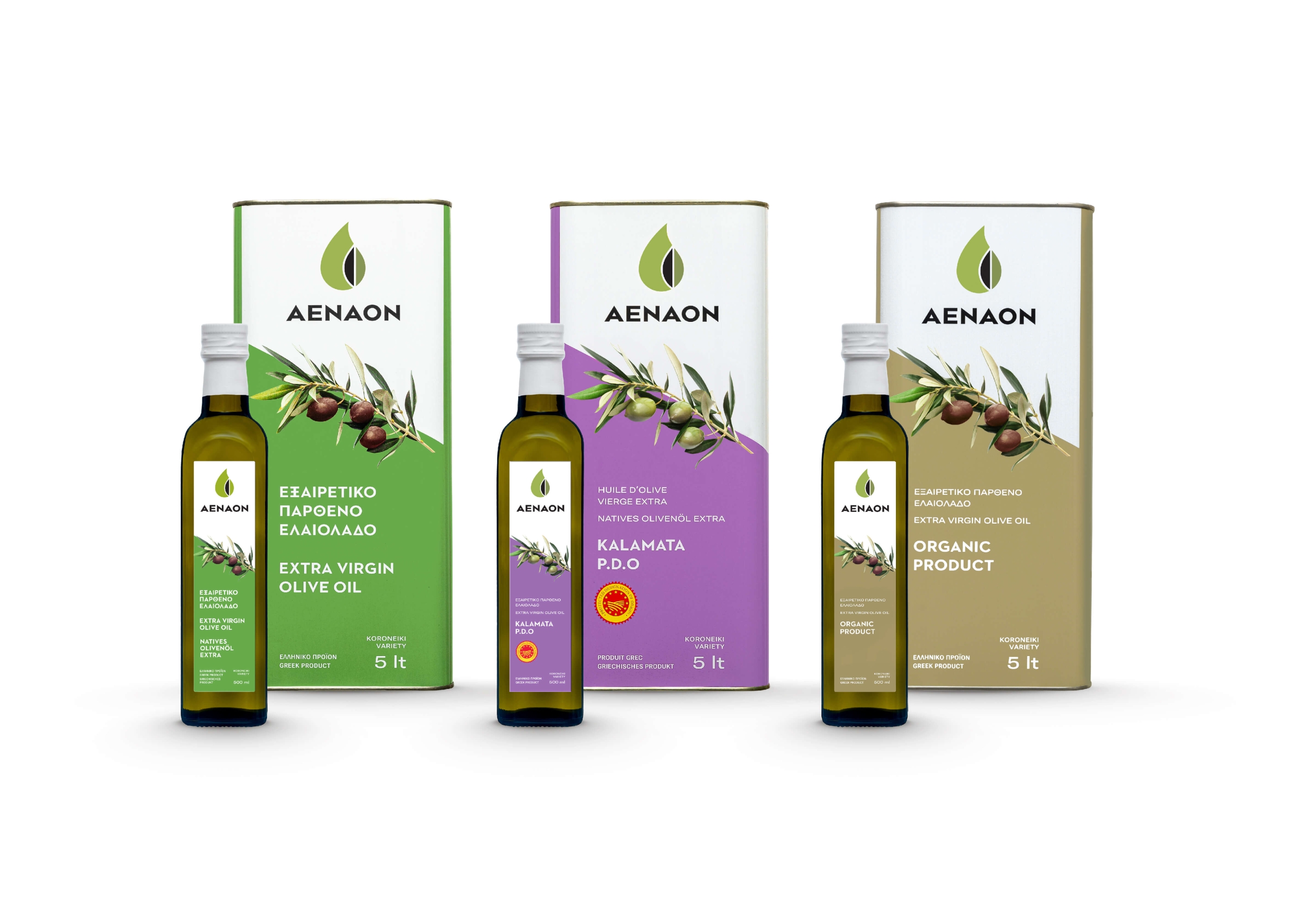
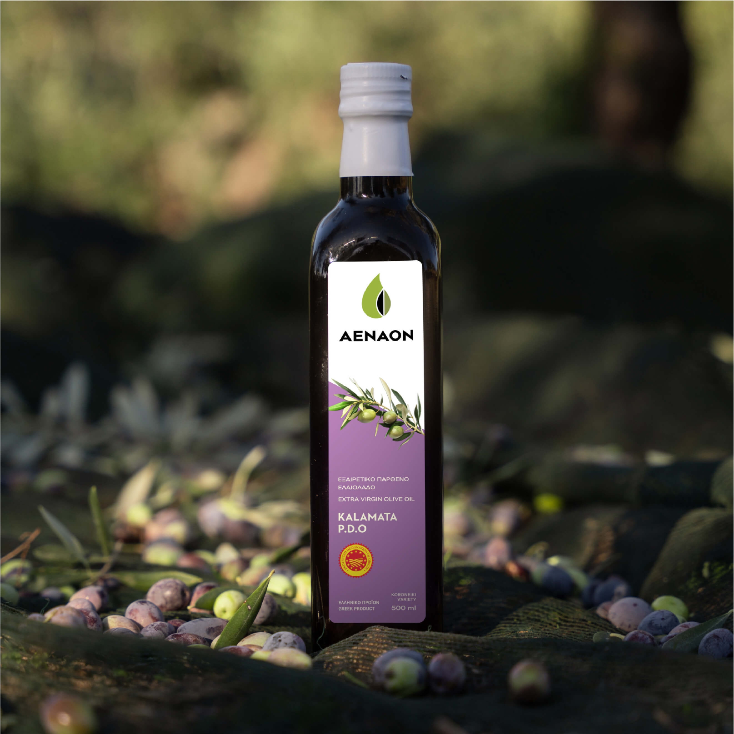
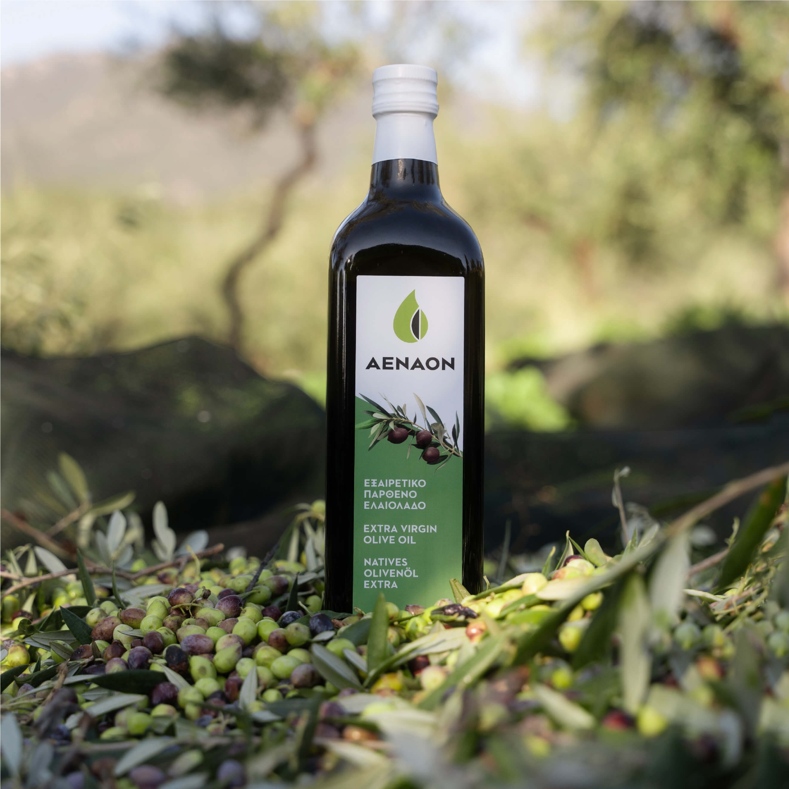
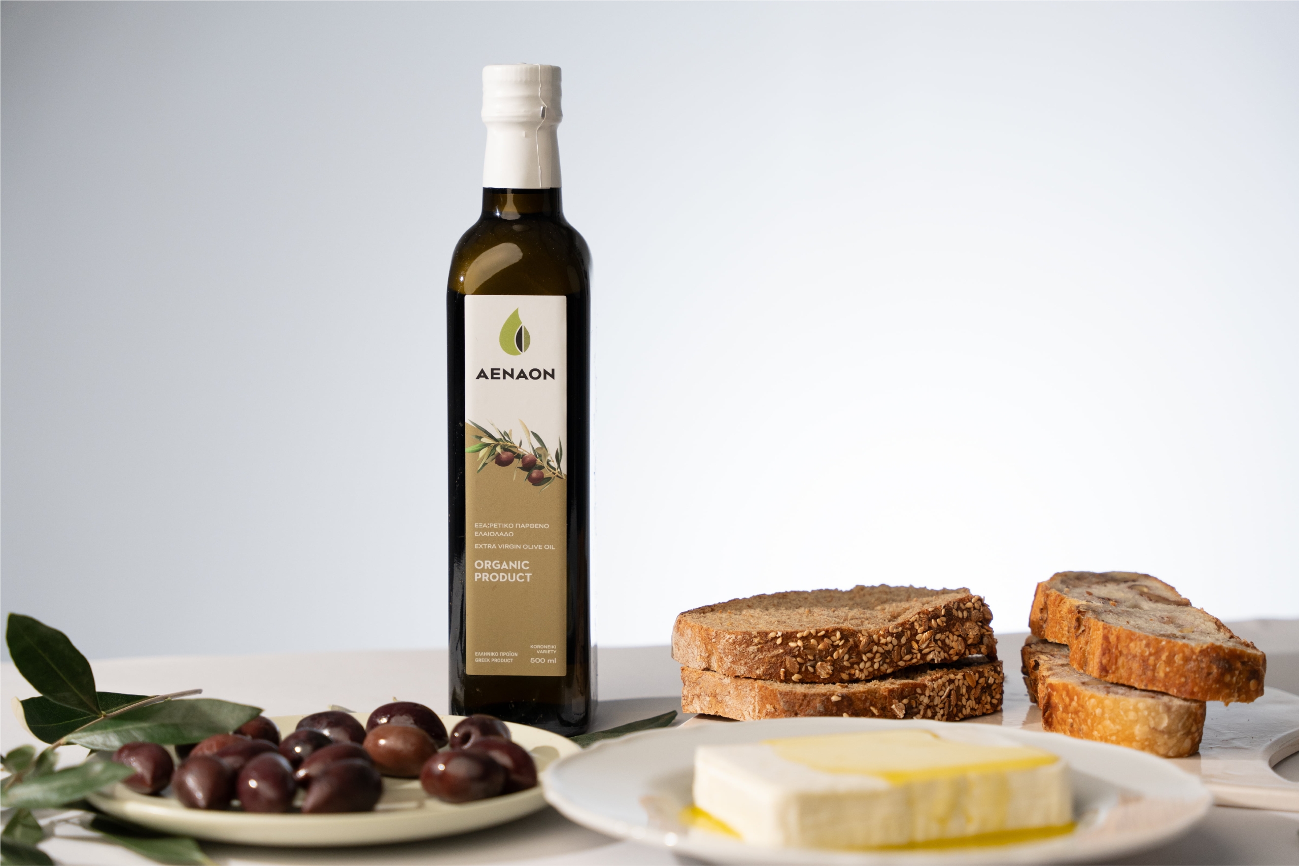
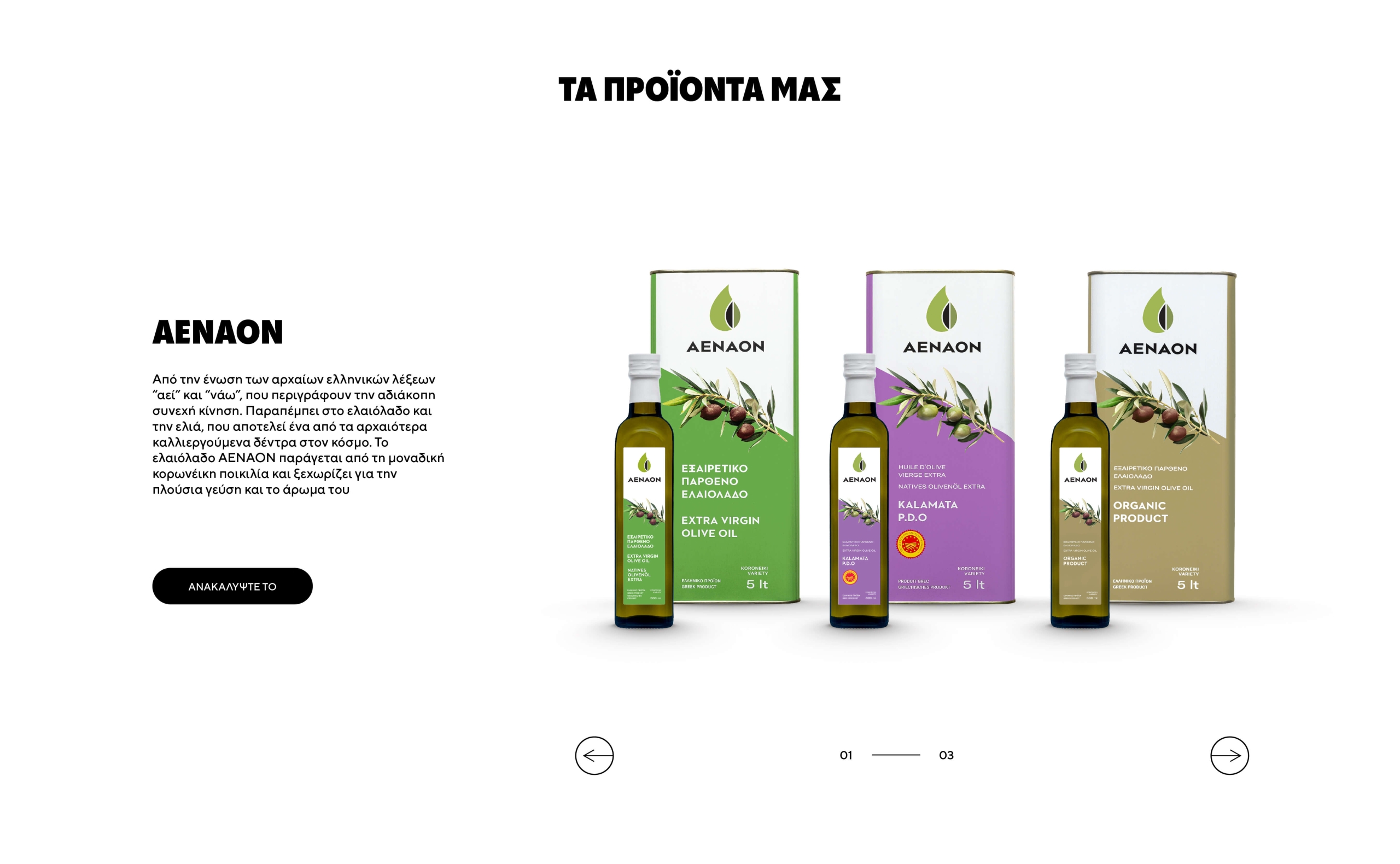
The redesign of the AENAON product packaging had a clear and meaningful goal: to shift from a sharper and more intense aesthetic to a friendly, earthy and authentic approach that reflects the product’s roots and respect for nature. AENAON products are inextricably linked to the land of Kalamata and the Greek countryside. The new packaging visually conveys this connection, with design choices that honor the light, the soil, the olive trees and the authenticity of the Greek landscape. The previous colour palette, full of strong contrasts, gave way to natural, earthy tones that enhance the sense of quality and timelessness. The logotype and font were retained, but modernized. The typography, inspired by Ancient Greek, took on a cleaner, more contemporary form. The logo mark, with its distinctive curves, was simplified and rendered with strength and balance, expressing the company’s “eternal” intention for evolution and progress. Finally, the olive branch, a timeless and powerful symbol of Greek identity, was retained as a core design element, reinforcing the brand’s visual continuity and serving as a natural link between past and present.