NEKTAR PACKAGING
The challenge
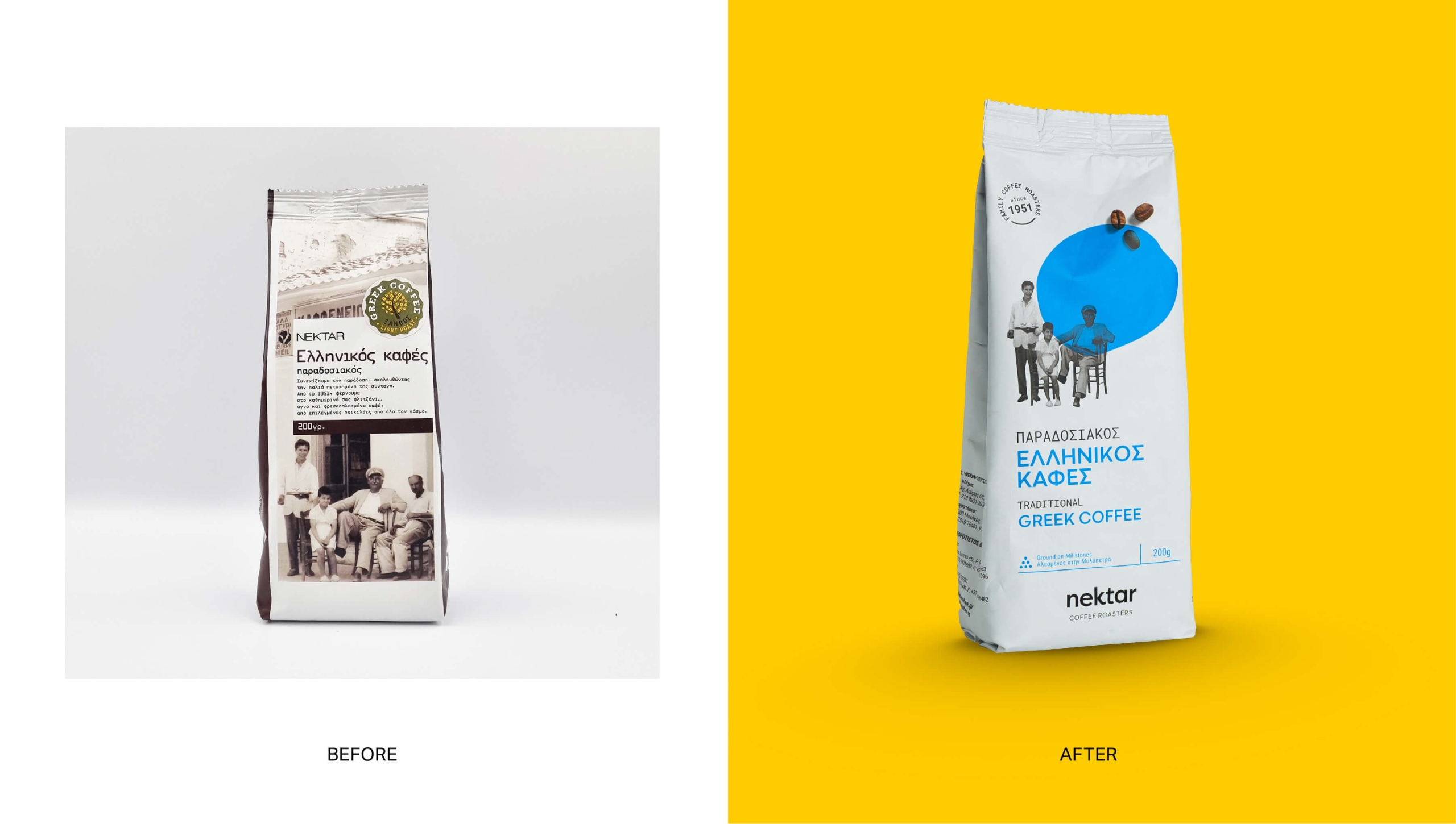
Nektar is a family business with a history that dates back to 1951 and a strong relationship of trust with its audience. However, the brand image no longer expressed the quality of the products, its values and the modern course of the company. The challenge was to renew its image, maintaining its authenticity and heritage, so that it would connect with today's market demands, without changing its deeply rooted values.
Services
Strategy
We started with research and strategic positioning of the brand, focusing on what made Nektar stand out for so many years: its family philosophy, its coffee expertise and the relationship of trust it has built with its customers. Our goal was not to create a new image that would distance itself from its past, but to bring a coffee company with a long history into the present.


Creative direction
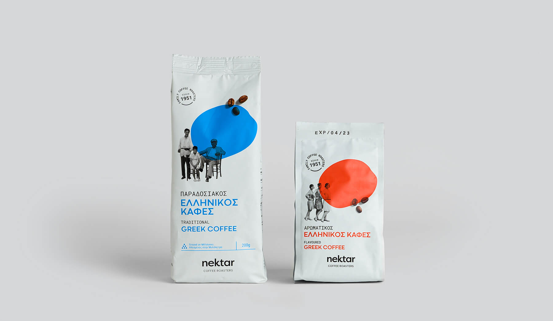
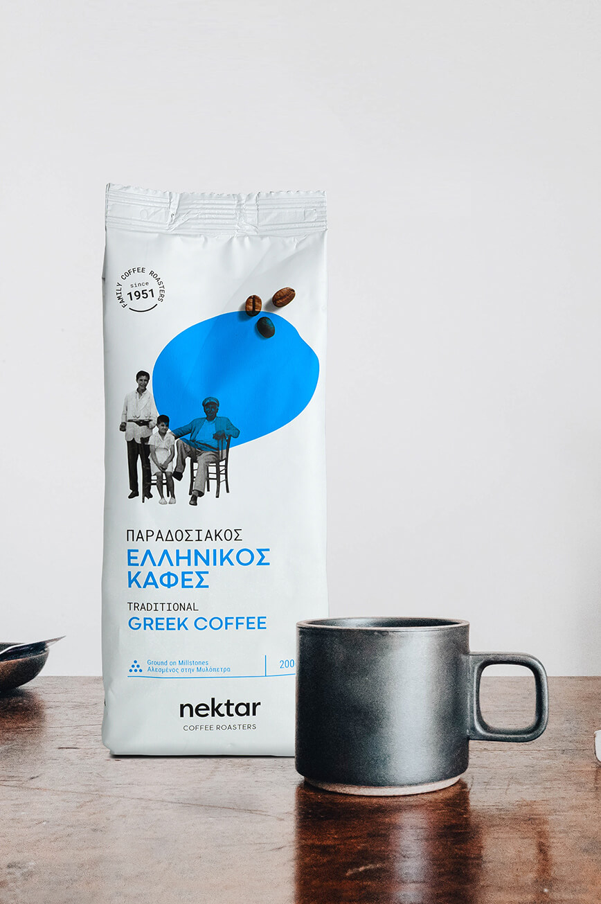
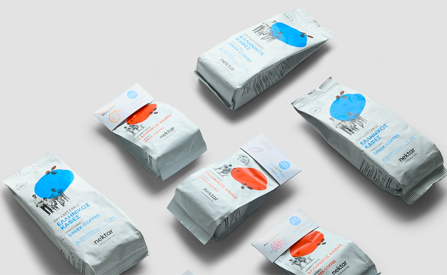
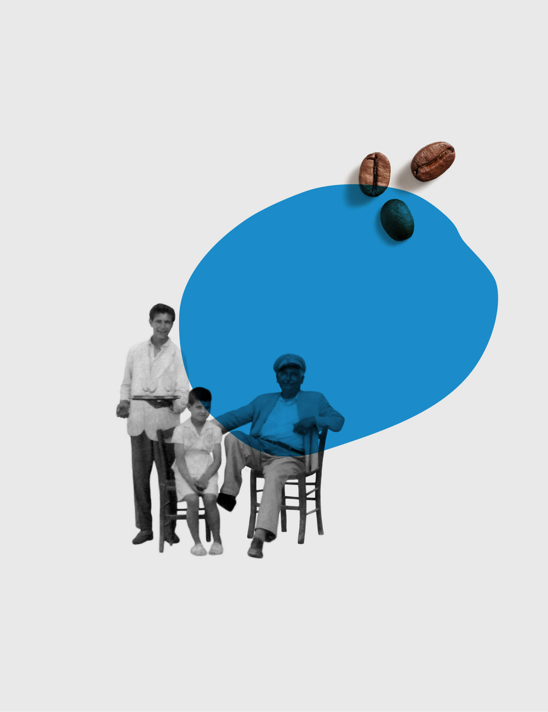
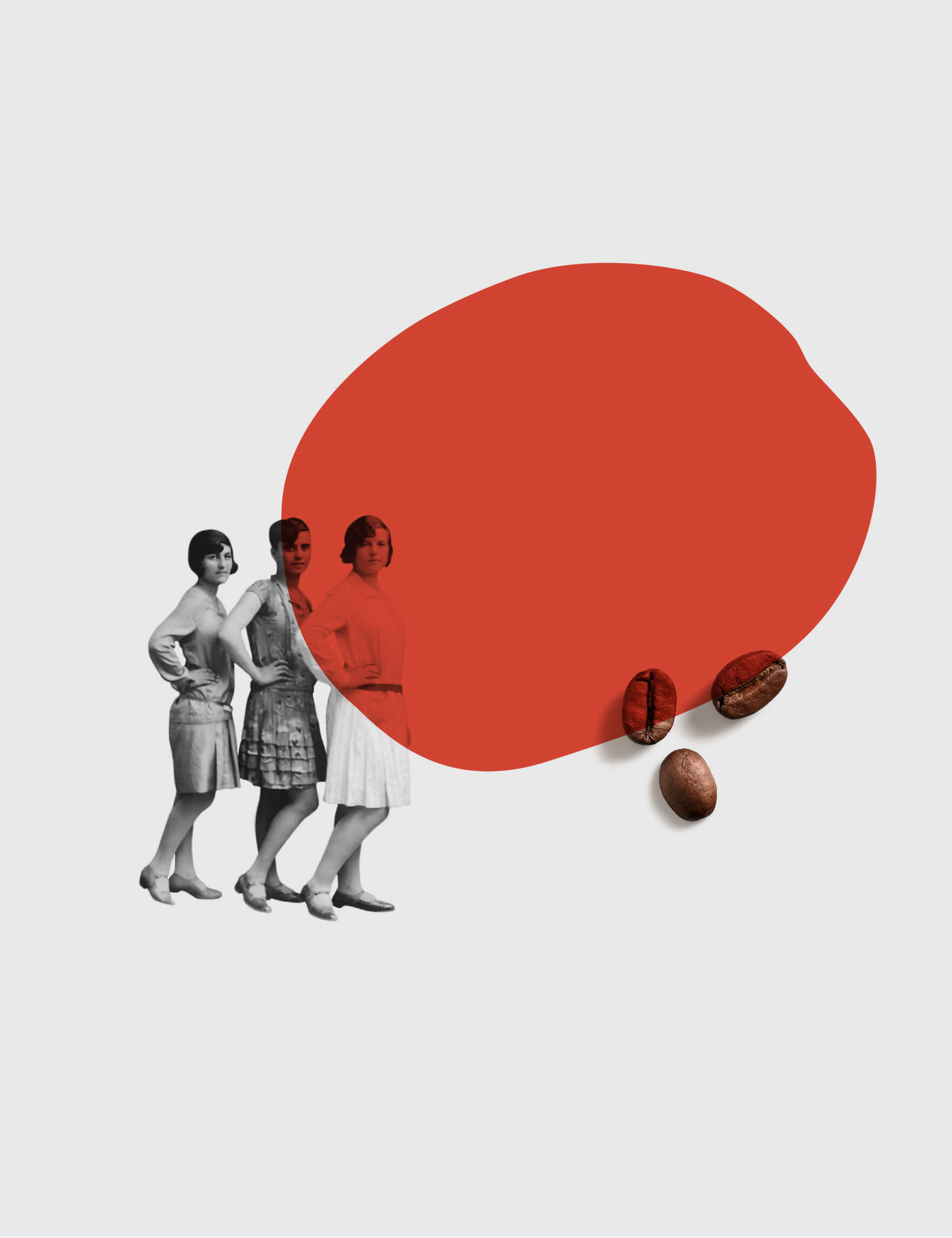
We designed the new packaging as well as the brand’s visual identity, based on tradition, family and the friendliness that this particular brand inspires. In order to stand out from the competition in the demanding, yet conservative, Greek coffee market, we chose a white color for the packaging, on which we placed black and white family photos in order to strongly emphasize the element of tradition and family. At the same time, through the abstract design of the coffee bean that we followed, a strong iconic element was created that separates Nektar from other brands and externalizes its modern character. Finally, the alternation of colors in the packaging (blue, orange) is a clear way to separate the product range. The same design philosophy was carried through to the digital world through the design and development of Nektar’s new website, creating a consistent brand experience across every touchpoint with its audience.


Results
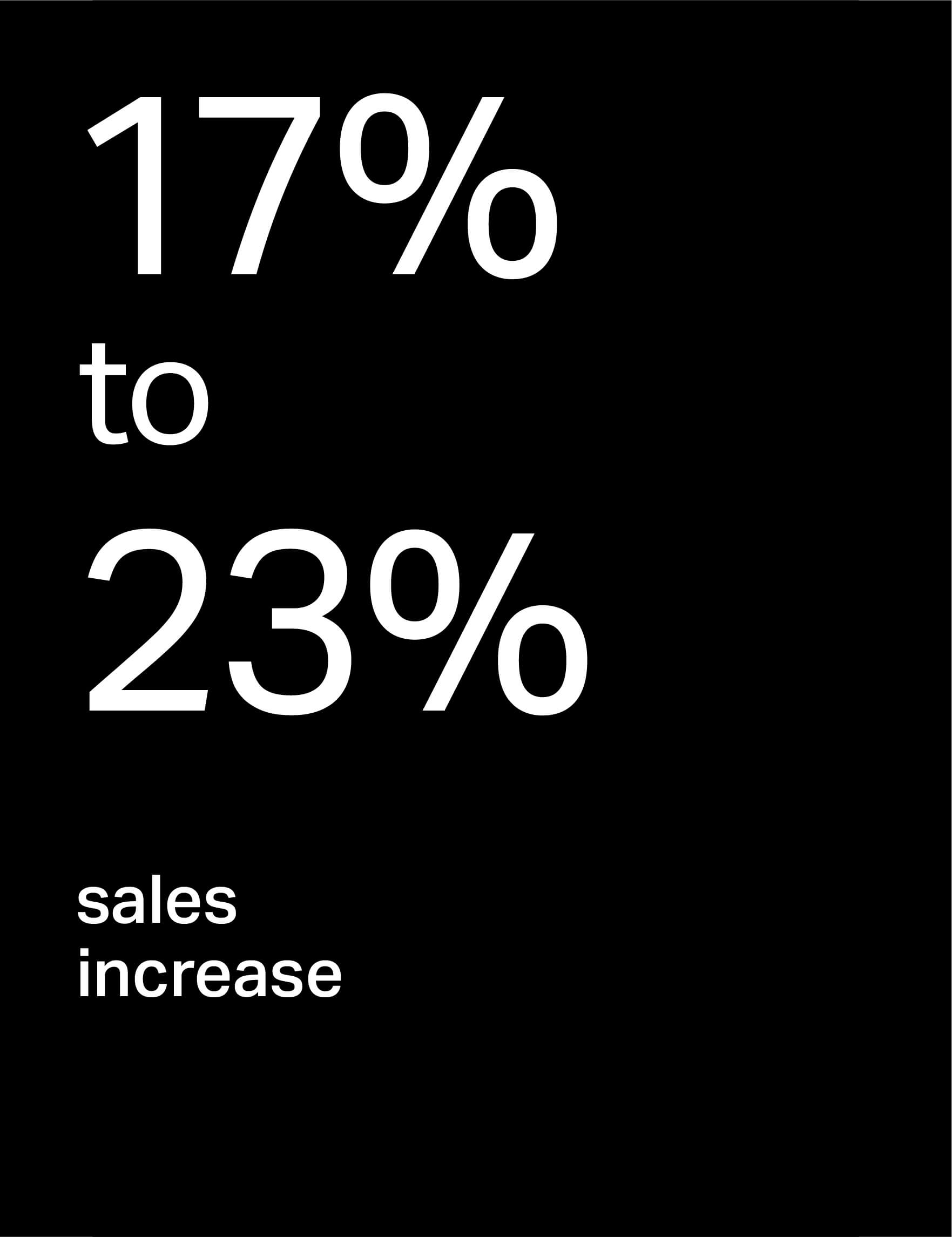
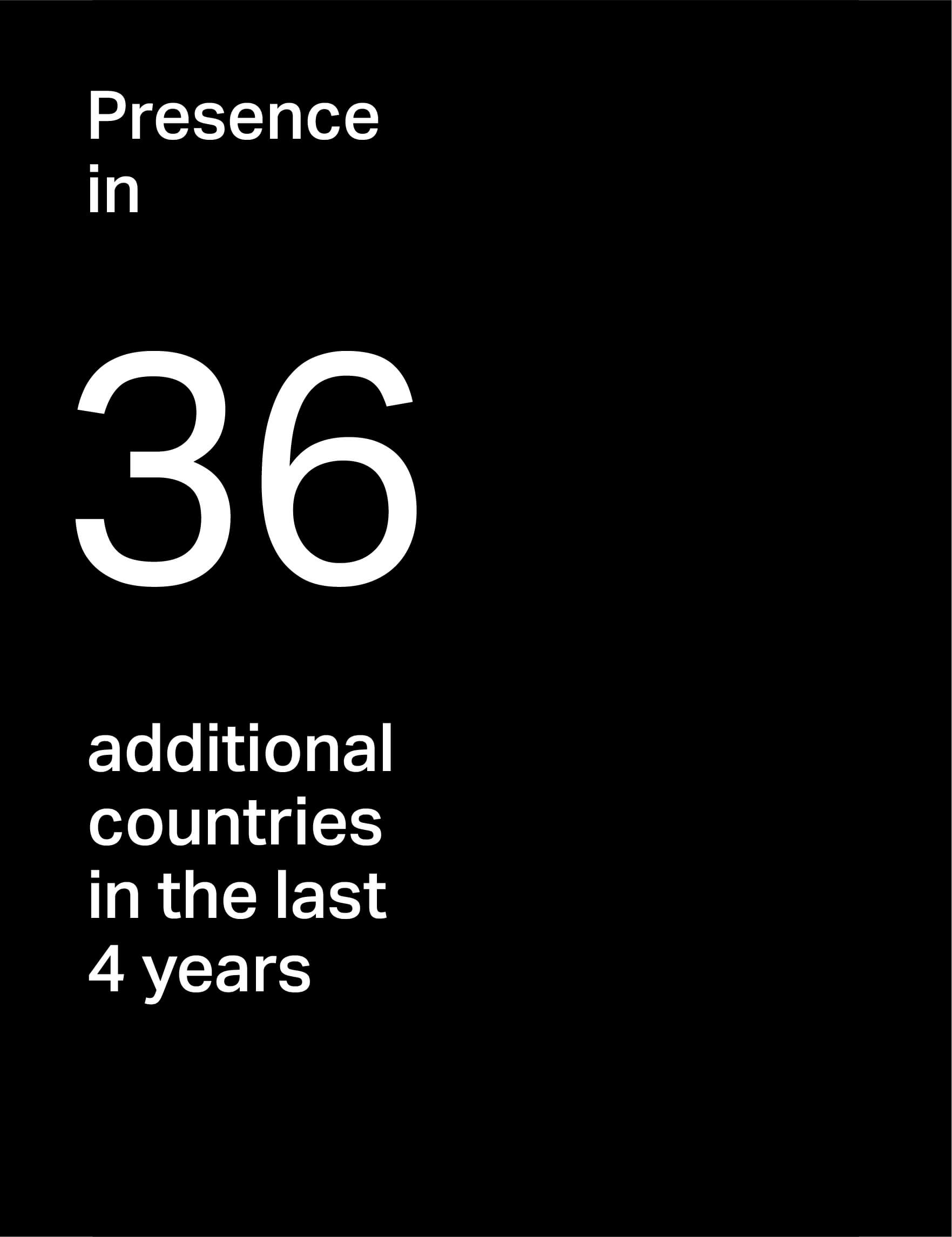
The new image gave Nektar a consistent and recognizable presence, clearly highlighting its core values. The branding contributed substantially to the company’s commercial development. New product lines were created, while the codes that acquired new packaging recorded a sales increase of 17% to 23%, confirming the importance of strategic packaging in the way the consumer perceives the value of a product. At the same time, the clearer brand identity supported its international growth. Within the last four years, Nektar gained a presence in 36 countries, while it created “Nektar Coffee Corners” in collaboration with selected partners, presenting the brand in a unified and integrated way in foreign markets. Furthermore, Nektar began collaborating with two large supermarket chains, which recognized the dynamics of the new image and the overall positioning of the brand. The result is a brand that remains familiar to the people who have trusted it for decades, while at
the same time possessing the appropriate strategic resources to grow in new markets, expand its network of partners and confidently address a new generation of consumers.
Testimonial
Through our collaboration with S&Team, we reshaped our corporate identity, established our positioning as a company to our B2B customers and printed new product packaging. With a clear image, communication message and visuals, we managed to create new product lines, increase sales by 17-23% in codes whose packaging image we changed and ‘open’ new markets abroad.
In the last 4 years, we have been present in 36 countries abroad and have created ‘NEKTAR coffee corners’ for our partners with a clear and comprehensive presentation of the NEKTAR COFFEE ROASTERS brand. Our company managed to start a collaboration with two large supermarket chains that were ‘tempted’ by our story telling as a company and our packaging. We look forward to the next projects we will work on together.
Iris Katsarou
Owner & Managing Director